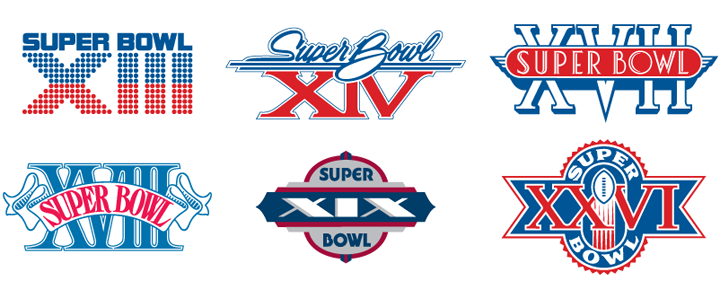
Super Bowl Artwork Ascendant—the Golden Era of Selling the Big Game
As we anticipate the upcoming Super Bowl XLIX matchup between the New England Patriots and Seattle Seahawks, we can take a moment to debate the merits of the current, standardized Super Bowl logo. Or, better yet, we can celebrate the rich aesthetic heritage that helped elevate the event to the unofficial American holiday that it is today.
Under the leadership of visionary creative director David Boss, the artwork that was commissioned to help sell and celebrate the Super Bowl broke new ground. The NFL's commitment to art, branding, and illustration at this time helped solidify the Super Bowl as the "biggest one-day sporting event on the face the earth."
I remember seeing some of this original art at the NFL's (now shuttered) Los Angeles offices in the early 2000s and remembering how influential it was in developing my own sensibilities about what a big sports event should look like.
Unique and powerful, each logo and illustration makes a brash statement. They are full of color and highly evocative of the local imagery surrounding the big game. Boss and the NFL commissioned top talent to help amplify the Super Bowl brand in those days. The artwork for Super Bowl XVII was done by legendary illustrator Charles White III (who I had the pleasure of visiting at his Venice Beach, California studio some years ago.) His airbrushed art screams late 1970s California cool, a singular moment in time—created at the epicenter of American popular culture, when commercial illustration was at its peak.Vibrant Super Bowl logos and posters continued to be produced in the years following Boss' retirement from the League in 1990, most notably during the tenure of his successor, Brad Jansen. It's somewhat hard to imagine, but there was a time that the Super Bowl needed selling.
The methods by which design and illustration are created have, of course, evolved since then. Perhaps inevitably, the warmth and evidence of human hand and mind behind each of these highly crafted pieces of art has given way to something slicker and far more corporate, safer, more bland. There is no sense of time or place conveyed in the standardized Super Bowl logo. Time will tell if the Seahawks' back-to-back appearances in the big game coagulate in our collective minds as one amorphous visual memory.
Is it even possible for any imagery to stand out in an era in which consumers are bombarded by an unceasing parade of visual impressions? There is, after all, a huge segment of the Super Bowl audience that only pays attention to the commercials. This has, over the course of the past few decades, become an intrinsically critical piece of the Super Bowl experience for many of us.
Once upon a time the Cowboys played the Steelers in the Super Bowl, smack in the middle of America's bicentennial celebration. The official program and poster art reflect this very individual moment in American history. Super Bowl XXI was played at Pasadena's Rose Bowl in January of 1987—in fact, the official logo contained the image of a rose (the Giants defeated the Denver Broncos.) The passage of time undoubtedly helps bind the official look of each Super Bowl game to the events that took place on the field. The character, impact, and quality of the artwork attached to the Super Bowls of this era continue to resonate today.


