The only trend is no trend at all
I've been doing some traveling lately, speaking with designers and creative folks in general, and speaking to design and advertising groups on sports branding. I've been asked about trends and about new identities and I always refrain from commenting publicly about aesthetics—as I will do here.
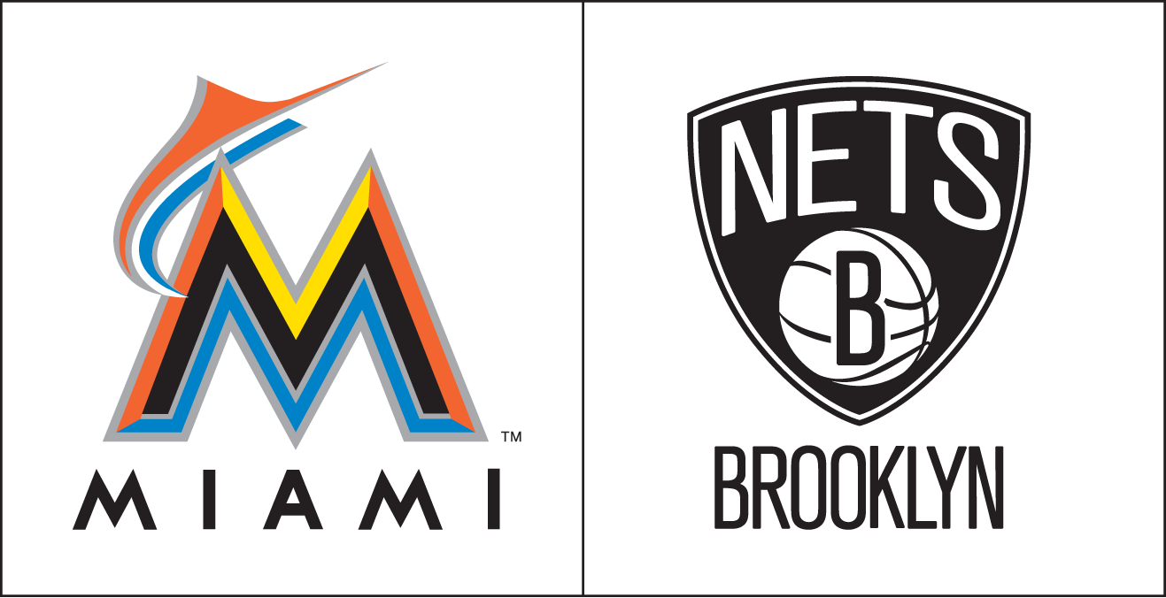
The two most recent major sports franchises to rebrand are the Miami Marlins and the Brooklyn Nets. Both organizations found themselves in a perfect place to pull the trigger on a new identity—starting a new era, moving into a new facility, changing the designation of their location, all signs pointed toward change.
What's striking to me is the fact that at first glance you'd be challenged to see any commonalities at all between the two. Miami is brightly colored with an abundant palette of five colors, Brooklyn is monochromatic, starkly black and white. Miami's identity is structurally complex and contains absolutely no visual references to baseball. Brooklyn features a basketball at the core of the visual package.
Sports branding doesn't necessarily run along a parallel track with consumer branding, but sometimes trends are evident and intertwined. The 70s and 80s featured iconic and graphically solid identities, the 90s witnessed highly complicated marks, often utilizing gradients and loads of small details—the product of the advent of computer technology in creating the art.
I've felt like we were in a period of "devolution" for some time now, but I'm now convinced that the only trend is no trend at all, for a multitude of reasons. The similarity between these wildly divergent logos? The prominent usage of the city/location designation underneath the icon, entirely removed from the focal point of the mark.

