Shiny silver Super Bowl, again
The biggest day of the American sports calendar, by any objective measure, is Super Bowl Sunday. This year the big game will be played in New Orleans on February 3.
As of right now we don't know who will be participating, but we do know what the logo will look like, and it will be (for the most part) the same logo as was utilized in 2011 and 2012.
The NFL's standardized Super Bowl logo was created by branding behemoth Landor. According to their website:
"Historically, the National Football League (NFL) commissioned a new logo for the Super Bowl every year; the design's theme was inspired by the host city. But starting with Super Bowl XLV in 2011, the logo no longer changed from year to year…A sports event of this stature needed a consistent, iconic identity—a symbol that fans could immediately recognize, much like the Olympic rings. The Vince Lombardi trophy, bestowed on league champions each year, was the ideal inspiration for a lasting symbol. Working with the NFL’s in-house designers, we created a logo befitting the trophy's prominence."
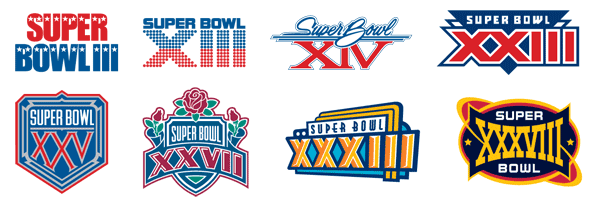
Prior to this standardized iteration, the identity changed every year. I created the logo for Super Bowl XXXVIII, played in Houston on February 1, 2004. Historically, the site of the game was often reflected in the mark. When viewed in retrospect, the logos of past Super Bowls serve as miniature visual guides to American popular culture, colorful, often optimistic, usually brash and unabashedly aggressive and, by all means, American. The current look is shiny and monochromatic, static, and decidedly corporate.
The New York Times had a great piece in 2009 (in which I was quoted) that summed up the rich visual history of Super Bowl logos and the connection that they have traditionally had to a distinct time and place in America.
The 2014 game will be played at MetLife Stadium, home of the Giants and Jets. It'll be interesting to see if the NFL deviates from the current look for this event, the first ever to be played in the New York area (and a potential goldmine for merchandise sales unparalleled in the history of the big game.)
Has this current look run its course? Did it ever work well? Is a generic logo a good idea for this event? The passion surrounding the annual logo is sometimes more pronounced than the enthusiasm for the game itself. Jump on in with opinions and comments.


