The Cardinals’ STL Logo Gets a Makeover
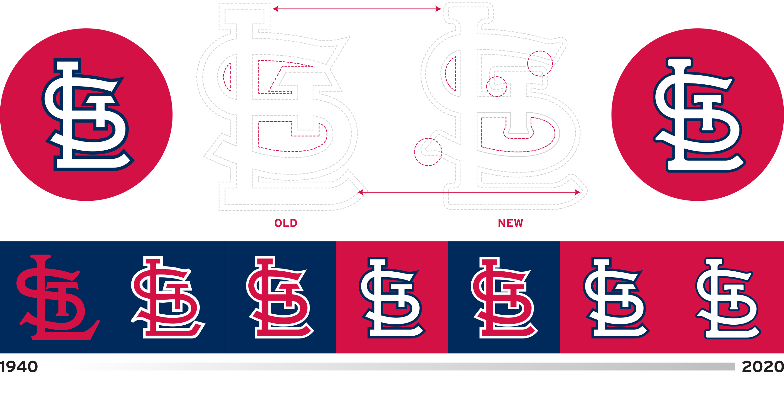
Like most well-established visual identities, the St. Louis Cardinals’ “STL” headwear monogram has steadily evolved since it was introduced well more than a century ago. 2020 brings slight but significant adjustments to the logo, changes that the average observer will likely not even notice—and that’s a good thing.
Tiny serifs have sprung forth. Sharp corners have been rounded off, making the overall appearance softer and a little more—“organic?” The smaller “T” has been shifted westward, and negative spaces have been made more harmonious.
The club engineered a soft launch of the mark during the 2019 season. It appeared in a variety of places, hiding in plain sight—on social media, on environmental signage in and around Busch Stadium, and on promotional giveaway items. When the Cardinals resume play the logo will appear on the club’s headwear.
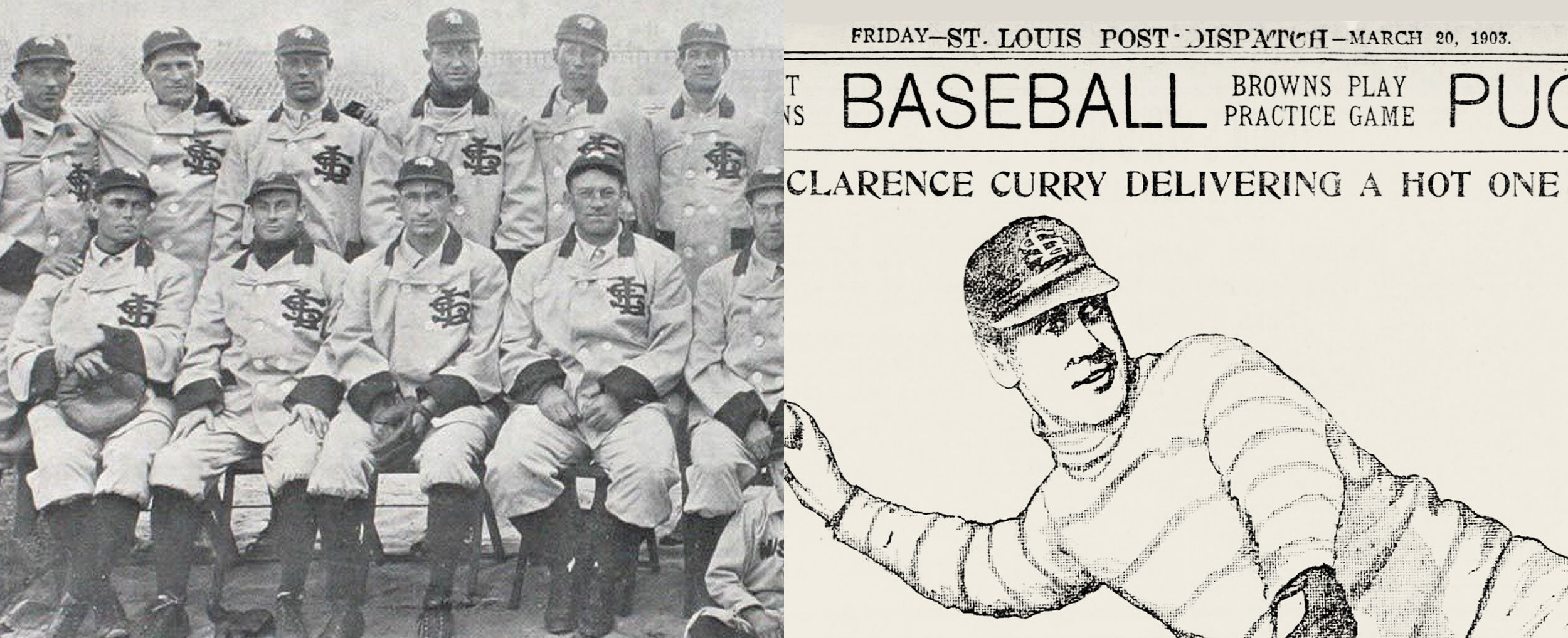
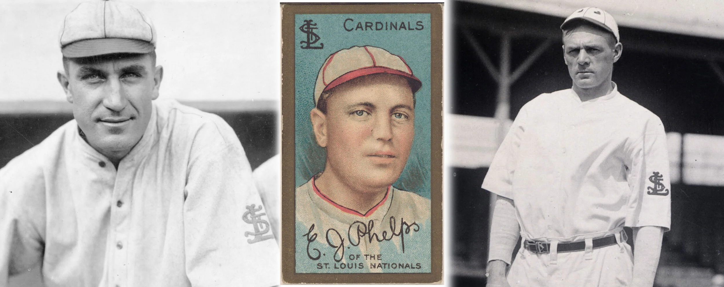
The club’s earliest headwear monogram dates back to 1901. It was an ornate affair, an “SL” (with no “T,”) rendered in white on cardinal red caps. Multiple iterations followed over the years, fancy lockups that were variously applied to jackets and caps and uniform sleeves. While the Cardinals wore an “STL” on their uniforms during their first World Series appearance in 1926, the franchise’s first great dynasty—the famed “Gashouse Gang ”of the early 1930s—sported plain striped caps and uniforms that exclusively showcased an early version of the club’s “birds on bat.”
The Cardinals’ second golden era took root a decade later, when the club won four National League pennants in five seasons, between 1942 and 1946. These teams wore a red interlocking “STL” on their navy blue caps. When the monogram was introduced in 1940, the St Louis Globe-Democrat proclaimed the lids (navy blue with red visors) to be “just about ‘carbon copies’” of the Cincinnati Reds’ and Chicago Cubs’ headwear.
A modified “STL” logo—red, outlined in white—was rolled out in 1956—part of a total visual revamp that saw the team’s two birds eliminated from the fronts of the Cardinals’ jerseys. This lasted but a single season, but the “STL” has endured.
1963 saw a newly revised “STL,” featuring a “T” with angled sides, appear on the caps. Three years later the sides of the “T” were straightened out. These two different variants were used concurrently along the way, but the angled version became the logo of choice starting in 2007.
These days the logo is applied to game caps using highly dimensional “puff embroidery,” a technique that tends to soften sharp edges. This most recent change to the emblem will play well with that dynamic. Sports design in 2020 demands “scalability”—the need for a logo like this to reduce down to tiny proportions and expand to huge dimensions with ease and seamlessness. With that in mind, the renewed mark will pass most any test thrown at it.
The Cardinals’ time-honored “STL” links generation of stars, from Stan Musial and Red Schoendienst to Lou Brock and Bob Gibson to Ozzie Smith and Albert Pujols. The intertwined characters are just a little bit different now, but the visual equity attached to decades of championship pedigree remains intact.


