The Mets lose Williamsburg

The New York Mets are celebrating their 50th anniversary in 2012, a history punctuated by some very high highs and some very low lows.
If nothing else, visual consistency has been a hallmark the club throughout their history. There have been uniform changes and color tweaks over the past five decades, but the general look of the franchise has remained unchanged—a primary palette of blue and orange, with the familiar skyline logo leading the way.
The logo was introduced by the club on November 16, 1961. Here is the preliminary art, as published in The New York Times the following day:
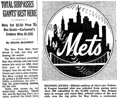
The article that accompanies the art states the significance of the specific buildings in the depicted skyline:

Finally, here are details of the 1962 logo, stacked up against the 2012 version, along with a close-up of the top of the Williamsburgh Savings Bank Building. Somewhere along the way, within the Mets' logo, the Williamsburgh Savings Bank Building became something else entirely.

It's obvious that this was not an intentional revision. This likely happened during the era when art was translated from physical to digital, sometime in the very early 90s.
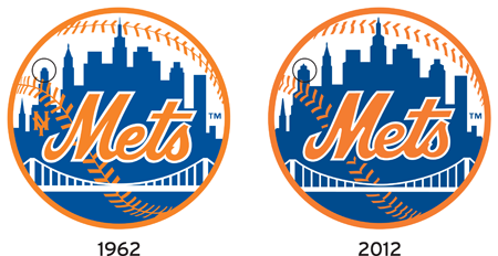
As if the indignity of being dropped out of the Mets' primary logo wasn't enough, the Williamsburgh Savings Bank Building is no longer the tallest building in Brooklyn—it was replaced by the Brooklyner, a residential building, in 2009.
Expanding upon the above description, the official Mets team history states the following:
"The circular Mets logo, designed by sports cartoonist Ray Gatto, was unveiled (on November 16, 1961.) It has gone virtually unchanged throughout the history of the club. The shape of the insignia, with its orange stitching, represents a baseball, and the bridge in the foreground symbolizes that the Mets, in bringing back the National League to New York, represent all five boroughs. It's not just a skyline in the background, but has a special meaning. At the left is a church spire, symbolic of Brooklyn, the borough of churches. The second building from the left is the Williamsburg Savings Bank, the tallest building in Brooklyn. Next is the Woolworth Building. After a general skyline view of midtown comes the Empire State Building. At the far right is the United Nations Building. The Mets' colors are Dodger blue and Giant orange, symbolic of the return of National League baseball to New York after the Dodgers and Giants moved to California. Blue and Orange are also the official colors of New York State."
Having dropped black from their uniforms, the team returns to their traditional roots of blue and orange this season. Their logo, so familiar for a half-century, still contains some notable New York landmarks—with the exception of Brooklyn's second-tallest building.