Sports Logo Case Study #7—Minnesota Twins
The seventh in an ongoing series of entries about vintage sports identities. Sports fans, as I have often said, are the most ardent brand loyalists on the face of the earth. There are stories to be told here at the intersection of art, commerce, history, and fandom.
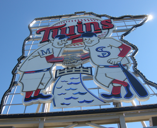
Visit Target Field in Minneapolis for a Twins game and you will be greeted by a 46-foot high neon sign of the club's original logo; the two mammoth twins Minnie and Paul, eternally shaking hands while spanning the Mississippi River. Minnie and Paul (of course) represent the great Twin Cities of Minneapolis and St. Paul and they will literally loom large over the 2014 All Star Game at Target Field.
The logo, in one form or another, has been a franchise fixture for much of its time in Minnesota since they first moved from Washington DC in 1961. The emblem made its debut on the day the franchise was designated as the "Twins," November 26, 1960.
The American League formally approved the move of the Washington Senators to Minnesota on October 26, 1960. The initial preference was for the club to be called the "Twin Cities Twins." Not wanting to favor either Minneapolis or St Paul, team owner Calvin Griffith ultimately compromised, settling on "Minnesota Twins," thus making the club the first MLB team to be named after a state. The legacy of this lives on in the Twins' headwear "TC," which has been a visual staple for the vast majority of the history of the franchise.

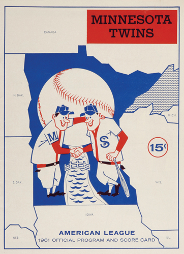
Illustrator Ray Barton (1930-2010) created the iconic image of two baseball players, shaking hands across a river late in 1960. Barton's obituaries indicate that the artist was told that this work was originally to be used only on paper cups for beverage concessions at Twins games at Metropolitan Stadium. Whatever the case, Griffith decided to turn the drawing into the team's official logo. Barton was paid $15 for his artwork.
Minnie and Paul originally sported identical "MTs" on their uniforms. This changed by opening day of the inaugural 1961 season to an "M" and a "STP."
The fortunes of the two twins have ebbed and flowed since that time—they were phased out in 1987 and were then revived as a sleeve patch for the team's 40th anniversary celebration in 2000. The club won two World Series without them, in 1987 and 1991. A revised version of the original logo returned to the club uniforms as a patch in 2002 and the twins have been embraced in a big way since the team moved into beautiful Target Field in 2010.

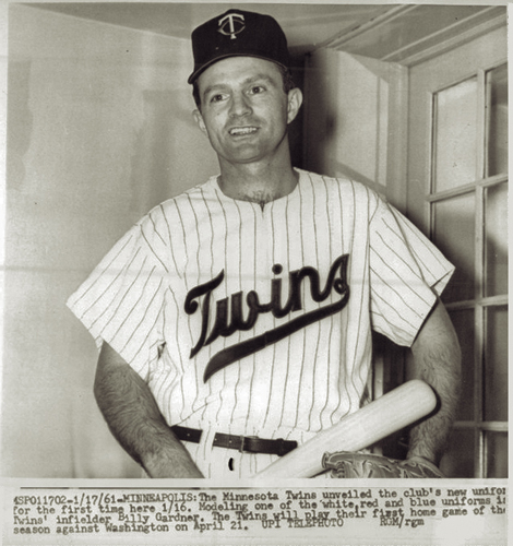
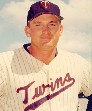
Finally, when the club introduced their uniforms for that first season on January 17, 1961 the "Twins" script featured both a tail and letterforms that would never see the field of play. The jerseys were revised prior to the start of the regular season—that script wordmark was worn for every single game, both at home and on the road, from 1961 until 1986. The script was revived as an alternate uniform in 2009 and remains part of the club identity today.