The Colorful Visual Legacy of the ABA
The American Basketball Association lasted less than a decade but it gifted us a great many good things, including the three-point shot, an endless highlight reel of slam dunks and gravity-defying 'fros, megastars Julius Erving, George Gervin, and Artis Gilmore, and four current NBA franchises—the Brooklyn Nets, Denver Nuggets, Indiana Pacers, and San Antonio Spurs. It also left behind a colorful and memorable visual legacy that still resonates today, fifty years after the league's inaugural season.
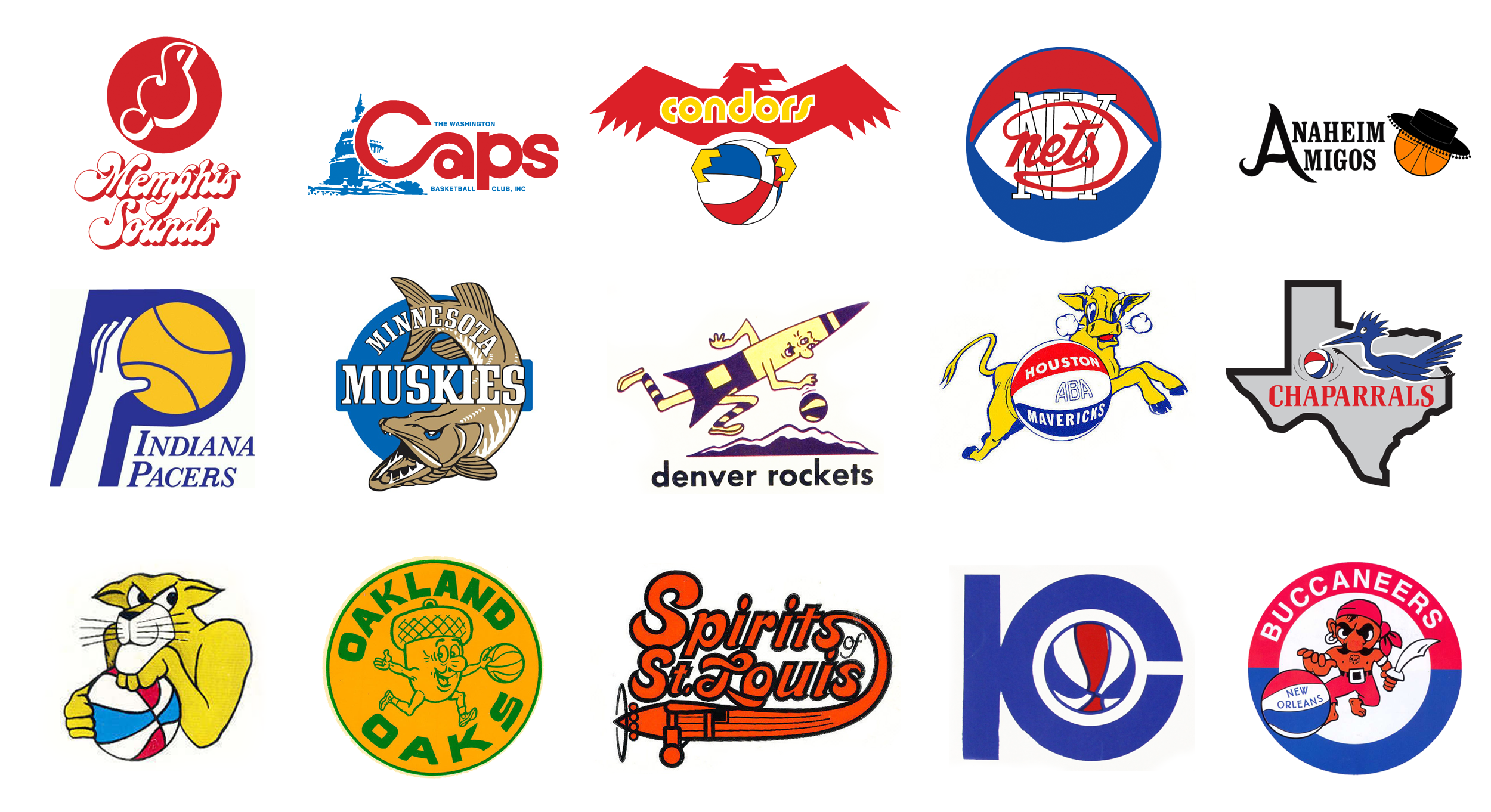
A quick glance at the ABA's first uniforms reveals a sea of comfortably conservative togs, with precious little in the way of color or personality. Reliably staid varsity-inspired jerseys with vertically arched lettering dominated the circuit's early years, along with a series of fun, but often predictable logos. The look of the ABA tracked the look of American professional sports in the late sixties, but as the league began to develop a vivid and vibrant identity, the visuals began to follow suit.
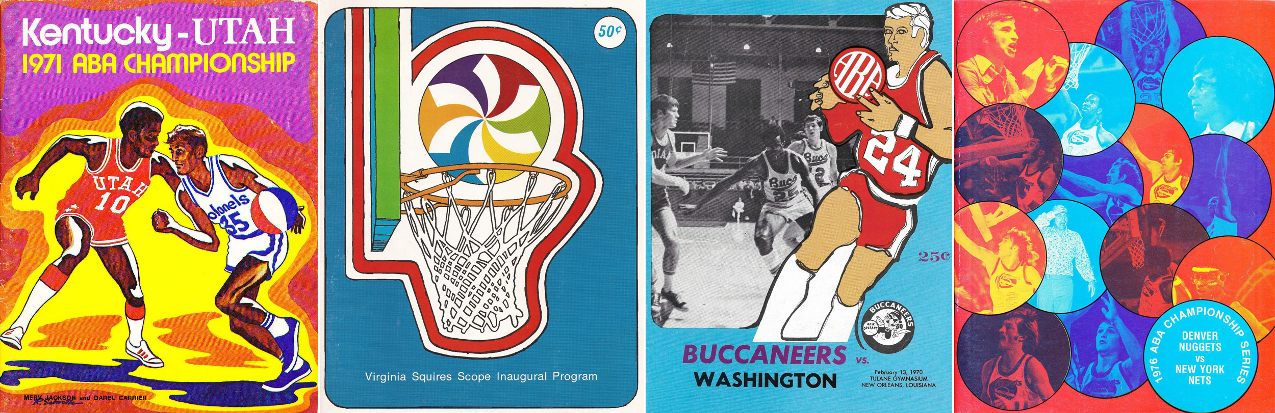
In 1968 the Los Angeles Stars took the court clad in powder blue road jerseys with a funky wordmark that seemed to have been inspired by Southern California's ubiquitous Googie architecture of the era, embodied by the whimsical vernacular signage of the region's countless coffee shops, bowling alleys, and dry cleaners. The Floridians, a regional franchise that played their home games at various locations in the Sunshine State, were outfitted in flashy black uniforms with vertical "hot orange" and magenta stripes that needed no jersey lettering to identify the team, the brainchild of team owner Ned Doyle, co-founder of advertising powerhouse Doyle Dane Bernbach. The Pittsburgh Condors' uniforms sported their strikingly contemporary logo, and the New York Nets, newly installed in the state-of-the-art Nassau Coliseum, were a visage in stars and stripes, boldly rendered in red, white, and blue.
Oakland A's owner Charles O. Finley brought his enthusiasm for Kelly green and gold uniforms to the ABA and to Memphis in 1972, a short but colorful stint that lasted but two seasons. The Spirits of St Louis began play in 1974 attired in burnt orange, black, and silver uniforms that featured a polished, classy logo that perfectly captured the charm of the league—brash, confident, oozing charisma.

The ABA was a seat-of-the-pants operation throughout the course of its nine season history, and the visuals accurately reflect that core dynamic. Teams were regularly folding, moving cities, becoming regional in scope, and changing up their graphics, often on the fly. (Author's note: If you have not read Terry Pluto's "Loose Balls," immediately step away from this page and go get the book. It details the ABA in painstaking and often painful detail, with nothing spared, the seminal account of the history of the league, bar none.)
More than four decades have lapsed since the ABA passed into oblivion, but its logos and uniforms never really went away.
The aforementioned four survivors—the Nets, Nuggets, Pacers, and Spurs—carried their core visuals with them to the NBA in the fall of 1976. The Pacers still wear blue and yellow, the same colors they have sported throughout their entire history (chosen to emulate the colors of the state flag of Indiana.) The Nets and Nuggets have pivoted visual identities many times since joining the Association, but the Spurs look remarkably similar to their 1976 ancestors, even with Nike's 2018 tweak to the team's long-lived uniform lettering.
A slew of NBA teams have garbed their players in ABA uniforms that have no real franchise connection whatsoever. The Miami Heat, born in 1988, have dressed up as the hot orange and magenta Floridians, an ABA team that lasted but four seasons. The Los Angeles Clippers have worn Los Angeles Stars throwbacks, and the Memphis Grizzlies regularly channel their inner Memphis Sounds, replete with hot buttered soul wordmark and uniform numbers.
The ABA and their upstart brethren, the World Hockey Association and the World Football League, looked fresh because they were fresh. ABA teams could afford to take chances with regard to their visual identities that the teams of the calcified NBA could not, and the results of these experiments were often lively and refreshing, even if they were also sometimes garish and unattractive by contemporary standards.
Finally, let's recall the ABA's most visible and enduringly memorable symbol, its signature red, white, and blue basketball. The league's first commissioner, Basketball Hall of Famer George Mikan, was a strong and vocal advocate for the tri-color ball, which was the subject of some ridicule when it was introduced. Amazingly, the league neglected to patent the ball's design, a costly miscue which can be measured in the millions of dollars all these years later. It's tempting to imagine a world where the league secured the rights to its trademark roundball and successfully licensed it, a move that could have helped stabilize their perpetually barren coffers. While we can only hypothesize what might have been, we can still celebrate the fallen league’s fun and funky visual legacy, a lasting tribute to big thinkers with small budgets.