The Cleveland Indians—and Chief Wahoo—return to the October stage
The Cleveland Indians are back in Major League Baseball’s postseason, looking to advance to their first World Series since 1997. While Cleveland sports fans are still basking in the soft afterglow of the the Cavaliers’ recent championship, the Tribe is seeking to win a World Series for the first time in nearly seven decades.
The Indians most recent championship team—the 1948 edition—wore a sleeve patch on their uniforms, just as this 2016 version does. Both depict Chief Wahoo, a longtime visual staple for the franchise, and one that’s loaded with conflicting impressions. For many, Wahoo is a divisive and offensive symbol, one that should be consigned to history. For others, Wahoo represents a prideful symbol, one that connects generations and unites a city.
Love it or hate it, the Indians’ Chief Wahoo has both endured and evolved since its introduction in 1947.
Chief Wahoo was actually preceded by another, somewhat similar character, drawn by Cleveland Plain Dealer artist Fred G. Reinert. This version appeared on team publications during the World War II era, but was never otherwise formally associated with the club.
Today’s Wahoo can be traced back to baseball’s greatest promoter, Hall of Famer Bill Veeck. When Veeck obtained a controlling interest in the franchise in 1946, he looked to gin up fan interest in multiple ways. One of them was the adoption of a visual icon to represent the club. The Indians commissioned the J.F. Novak Company—an operation that still exists today—to create a new emblem for the team. The Novak Company specialized in the embroidery of police and firefighter patches (it still does.) This would suggest that the new emblem was intended to serve primarily as a sleeve patch.
A Novak draftsman, 17 year-old draftsman Walter Goldbach, created the first iteration of Chief Wahoo. Introduced in 1947, his version appeared on a wide range of goods and team publications. Goldbach has been quoted as saying that he was tasked with “creating a mascot that ‘would convey a spirit of pure joy and unbridled enthusiasm.’” In a 1999 Associated Press interview, Goldbach stated "the last thing on my mind was trying to offend anybody." No matter one's opinion of Wahoo, it's fair to say that no one, especially a 17 year-old artist, could have imagined the controversies that would envelop his creation decades later. (A footnote—I met Goldbach, in Cleveland, in 1997. He was selling prints of his original artwork.)

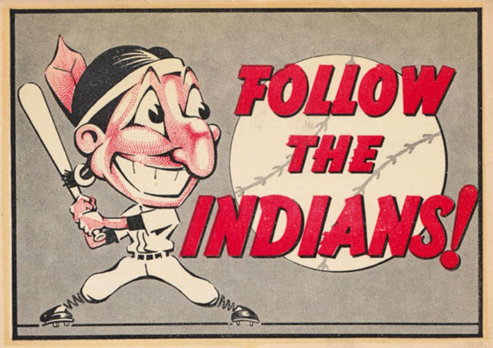


The following season, 1948, the Indians defeated the Boston Braves in the Fall Classic, thus vaulting the team (and Wahoo) to the top of the baseball world. Although the team’s uniforms continued to feature Goldbach’s version of Wahoo, the symbol had already started to morph into something that closely resembles the sleeve patch that the Indians are still wearing today.
Another World Series appearance in 1954 help to cement Wahoo’s place as a visible and prominent component of the club’s visual identity. The winds of public opinion had, however, already started to shift. In the 1940s, the National Congress of American Indians (NCAI) created a campaign to eliminate negative stereotyping of Native Americans in the media. This eventually led to a closer, more critical examination of Native American names and mascots in sports.
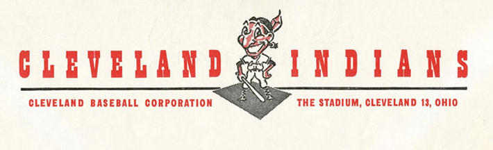
Nearly a quarter century later, in January 1972, the American Indian Center of Cleveland filed a lawsuit against the Indians for libel, slander, and defamation, stemming from the use of Chief Wahoo. The next season, under new ownership, the club rolled out a revamped version of the Chief, created by designer Leonard Benner. It eliminated the color red from Wahoo’s skin. It also depicted Wahoo at bat, an effect which served to minimize the Chief’s head. The new logo also reduced the size of Wahoo’s nose, and shadows were added. In a 1995 Akron Beacon Journal article, Benner said that he “streamlined him so Indian people wouldn’t be offended.” He also called the version that he was replacing "hideous."


This version of the Chief was utilized for a short time, until 1978, before being replaced with a close relative of the logo that we still see today.
The popularity of the 1989 film “Major League” helped to secure Wahoo’s status in Cleveland. World Series appearances in 1995 and 1997 also gave a boost to the Chief, despite multiple protests.
Flash forward to today. Chief Wahoo is no longer the team’s primary logo, having been replaced by a simple red block “C’ in 2014. It is used somewhat sparingly, most prominently on the team’s home caps and on the sleeves of all uniforms. But, even with a diminished presence, Chief Wahoo continues to incite both protest and pride, both of which we will likely hear about as the club navigates its way through this October run.