Sports Logo Case Study #8—Pittsburgh's Many Pirates
The eighth in an ongoing series of entries about vintage sports identities. Sports fans, as I have often said, are the most ardent brand loyalists on the face of the earth. There are stories to be told here at the intersection of art, commerce, history, and fandom.
The Pittsburgh Pirates have demoted their pirate logo to b-status. Their familiar "P" headwear mark—a Pittsburgh constant since 1948—has now shifted to the front of the pack as the club's official primary logo.
Several distinct variations of a pirate have represented the National League's Steel City franchise over the past 80 years.
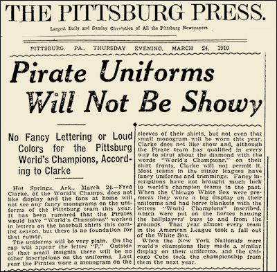
In the early years of the 20th century, Pittsburgh fielded teams with uniforms that emphasized typography, as witnessed by this 1910 newspaper account describing the club's new look for the coming season:
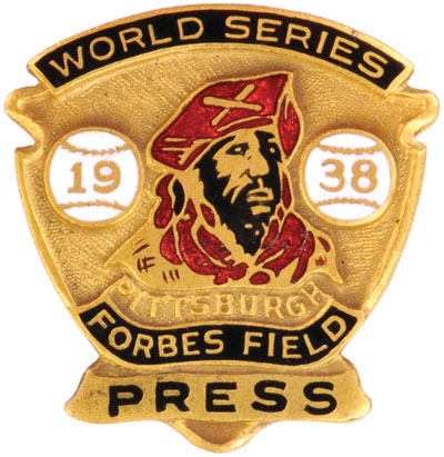
The franchise first formally employed an illustration of a pirate as their symbol—used on club letterheads and roster guides—as early as 1934. He continued to be utilized as their official symbol right up until the World Series championship 1960 season.

In 1940 the club opted for a new pirate symbol, based on the above illustration. This pirate head was the first visual manifestation of the team's nickname to be featured on the field of play. While the emblem did not enjoy a long shelf life—it was dropped after only two seasons—it became the basis for the 1987 primary club logo that was introduced in conjunction with the club's centennial season.
Somewhat amazingly, the image of a pirate did not appear on team uniforms again until the aforementioned 1987 season.


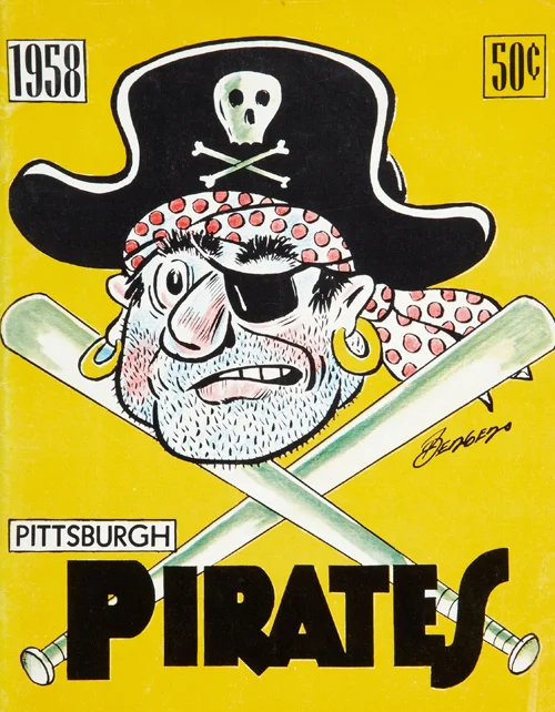
The pirate image that was used beginning in the early 30s was formally replaced by a cartoon image of a stubbled buccaneer, drawn by longtime Pittsburgh Press artist Jack Berger, Sr., in 1958. (It was also memorably redrawn by Pirate and current National League MVP Andrew McCutchen in response to a challenge I posed to him on Twitter in September 2012.)
This pirate celebrated the Bucco's 1960 World Series win (along with the 1930s-era pirate, by then relegated to a much less visible role.) A newer, friendlier, and more realistic pirate made his debut in 1967. This buc was illustrated by artist Bob Gessner (who was also responsible for the NHL Pittsburgh Penguins' skating penguin logo.) Associated with a golden era of Pittsburgh Pirate prosperity, the "smiling buc" represented the franchise during World Series titles in 1971 and 1979.

By 1987 the Pirate brand needed a refresh. A series of down years, combined with scandal, front-office turnover, and the team's centennial season resulted in a new logo that featured a buccaneer directly derived from the one on the 1940-41 uniforms.

This visual representation of the club was used for a decade before being replaced in 1997 with yet another new pirate, described as a "modernized buccaneer."
Pirates managing general partner Kevin McClatchy characterized the makeover as being part of "the dawning of a new era in Pirates history." This logo served the club for 17 seasons, a visual bridge from Three Rivers Stadium to beautiful PNC Park.

The shift in emphasis toward the "P" represents yet another example of a continuing "devolvement" in identity design for all sorts of consumer brands. The new primary logo is both familiar and proprietary; it has the benefit of having accrued nearly 70 years of brand equity and has deep resonance for Pittsburgh fans. Whether or not it becomes a transitional mark before another pirate is introduced at some future point remains to be seen, but the fact is that the team has a rich visual heritage and a very defined brand DNA.