Sports Logo Case Study #1—Montréal Expos
The first in an ongoing series of entries about vintage sports identities. Sports fans, as I have often said, are the most ardent brand loyalists on the face of the earth. There are stories to be told here at the intersection of art, commerce, history, and fandom.
Major League Baseball's Montréal Expos were born 45 years ago this week. They played their final season in Canada in 2004 before shifting to Washington the following season and becoming the Nationals.
Montréal was granted an expansion franchise by the National League on May 27, 1968. Five cities were in the running for two new NL franchises: San Diego, Montréal, Dallas-Ft. Worth, Milwaukee, and Buffalo. Montréal was a decided underdog; an Associated Press story published on the morning of the formal vote declared that "Montréal, at present, simply doesn't figure."
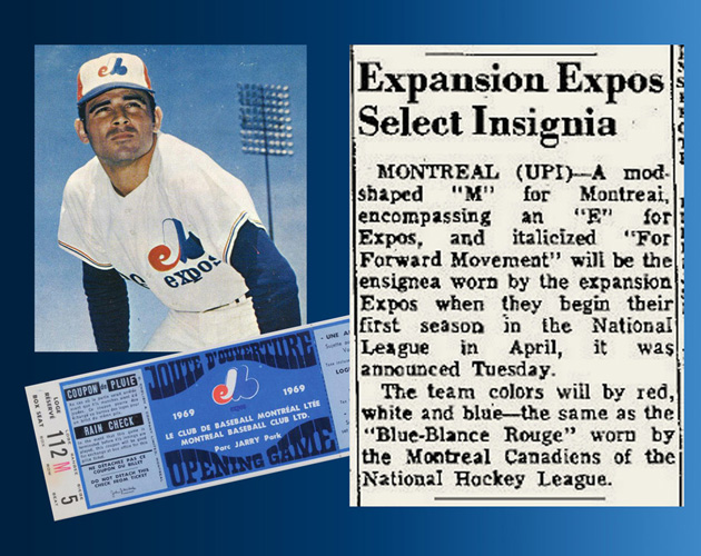
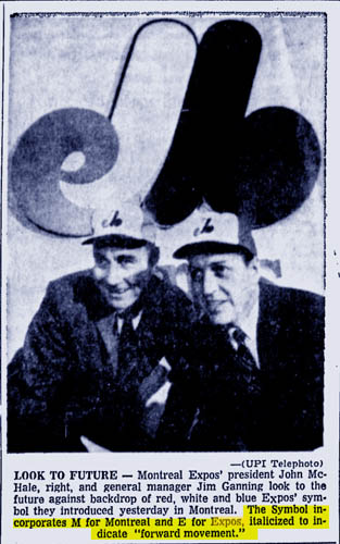
The franchise was officially announced as having been named "Expos" on September 5, 1968 and their logo and caps were unveiled at a press conference on January 15, 1969.
What exactly does the logo represent? This question has been asked many times over the years. Contemporary reports take note of the "forward movement" of the emblem and the fact that it "incorporates M for Montréal and E for Expos."
A January 15, 1969 Calgary Herald article about the logo unveiling describes the emblem as "a mod-like shape of an "M" encompassing a small "e."
Other interpretations surmise that it's a French thing, an "eMb," which represents "Expos de Montréal Baseball."
Additional theories include:
- "MB" for "Montréal baseball."
- "CB" for team owner Charles Bronfman.
- "EB" for Ellen Bronfman, daughter of team owner Charles Bronfman, and
- "ELB" for "Expos League Baseball."
The club seemingly gave a definitive explanation starting in the late 80s and early 90s—"The Expos logo is composed of three letters, the largest of which is the overall stylized "M" for Montréal. Represented in the lower left of the logo is a lower case "e" for expos and on the right hand side of the logo, in blue, is the letter "b" for baseball." While this may stand as the final word, it seems unusual that this explanation came some two decades after the logo's debut.
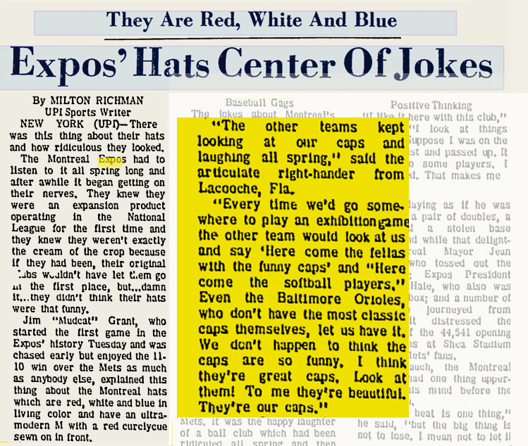
Whatever the real symbolism, the Expos' identity represented a true departure from traditional MLB branding when it was launched in 1969. I've often said that these looked "foreign" to me as a kid growing up in the 70s; an appropriately different look for the only MLB team located outside of the United States. The club's "pinwheel" paneled hats were noted for their unique qualities right from the outset of their inaugural season.
The core part of the identity was enclosed in a circle prior to the 1992 season and it remained in use up until the club's move to DC in 2004. The logo remains popular in its afterlife, a nostalgic nod to a departed franchise and a colorful, stylish—and mysterious—piece of design.
