Rugby United New York
What unites New York? Rugby United New York is a young professional rugby franchise, founded in 2018. The club engaged me to expand their visual presentation, which was a really fun challenge for this native New Yorker (born in Manhattan, went to college in Manhattan, have lived in the metropolitan area my entire life.) New York is, of course, so many things—a sprawling metropolis with a population of nearly 8.5 million human beings who speak hundreds of different languages, packed into about 300 square miles.
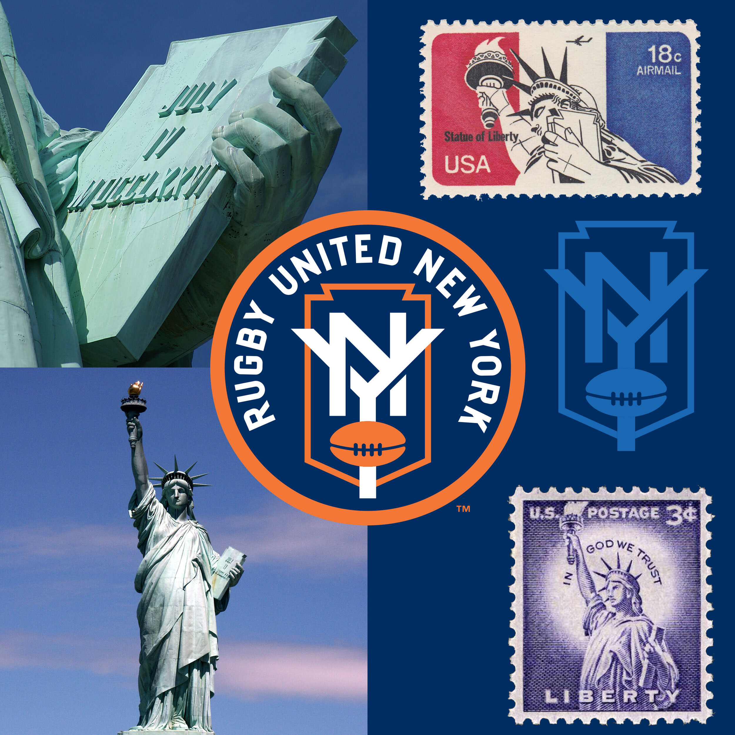
The shape that contains the “NY” is meaningful, even if it's a little bit obscure. The Statue of Liberty—one of America’s most meaningful and enduring symbols—has welcomed countless immigrants to New York and to the USA since 1886. The National Parks Service, describing one particular, key feature of Lady Liberty: “Entering the statue you can see the armature bars, saddles, rivets and the inner sides of the thin copper walls. Liberty’s keystone-shaped tablet is cradled in the left arm. It is a representation of law written down for citizens of the nation to see and read. Upon it, “July 4, 1776” recognizes the date on which the American colonies declared their independence from England…the keystone in architectural design is a critical component. The stone specifically cut into this shape supports all others within an arch. Therefore, the tablet pays homage to our republic’s keystone document: the Declaration of Independence.”
The mark was inspired by some of the decorative tiles that are dotted throughout the entirety of New York’s 245-mile long subway system. RUNY’s orange and blue colors are the official colors of the City of New York, a reminder of the city’s Dutch roots.
I created bespoke letterforms for the team, and therein lies a story. I bought the above sign at the New York City Transit Museum’s “yard sale” back in the late 1980s (yes, there actually was such a thing.) The sign dates to the 1930s. It’s big, over four and a half feet long, and it’s made of steel and coated with porcelain enamel. It’s ridiculously heavy. But it’s the letterforms that have always spoken to me—organic, quirky, bold, and incredibly legible. Signs like this are still strewn throughout the subway system, and they are a familiar sight to the millions of people who travel through it every single day.
RUNY’s orange road jersey contains the names of hundreds of New York neighborhoods, arranged in a five “stripe” pattern, a salute to the city’s five boroughs. Every nook and cranny of the city gets a callout here, from Inwood, in northern Manhattan (where my father grew up,) to Tottenville, located on the southern end of Staten Island. The exploration of patterns for a blue home jersey led to an inspiring connection—Guastavino tiles, which are found in a bunch of prominent New York locations. This “tile arch system” graces the ceiling of Ellis Island’s Registry Room, the Great Hall where immigrants embarked upon their first steps in the new world. Guastavino tiles also grace the lower level ceilings at Grand Central Terminal’s “Whispering Gallery” and Oyster Bar, as well as the soaring arches of the Municipal Building and the arcade beneath the Queensboro Bridge.


