Minnesota Visualized: All-Star 2014
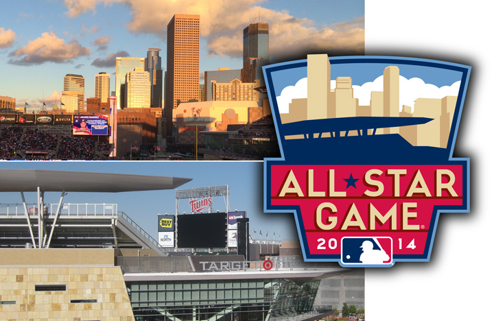
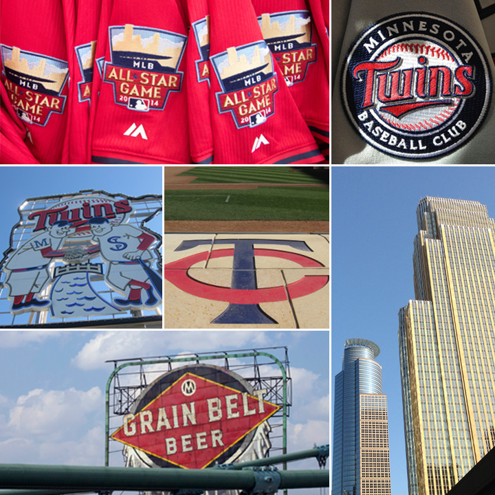
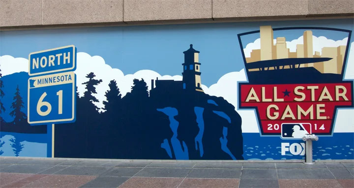
Back from All-Star Week in Minneapolis, where the Minnesota Twins did a great job hosting their third Midsummer Classic (the first two were played in 1965 and 1985.) Minneapolis is one of the most design-savvy cities I've ever been to, a place where visual inspiration resides everywhere you turn. I've called it an American version of Barcelona—a vibrant urban streetscape where even the manhole covers are lovingly designed. The architecture, colors, and letterforms that helped contribute to the look of the 2014 All-Star Game are evident all over the place. MLB's press release heralding the official logo does a good job of summarizing things: The official logo of the 2014 All-Star Game focuses on the iconic ballpark structure enveloped in vibrant downtown Minneapolis. The Twins' core colors of navy and red are supplemented by tan and sky blue. Tan signifies the locally quarried limestone used throughout the ballpark, and the sky blue symbolic of the clear Upper Midwest sky. The retaining keystone shape is inspired by the Twins' historic and beloved Minnie and Paul logo. Extended art usage included the iconic Split Rock Lighthouse, way up north in Silver Bay, Minnesota. As is the case with many northern locales there's a certain quality of light that exists there that produces incredible clouds and shadows. Count me as a big fan of Minnesota. I've been there three straight years for one reason or another, including a summer vacation last year that extended to the northernmost part of the state, up to the Gunflint Trail on the Canadian border. Wonderful people, compelling visuals, good food, and one of the nicest ballparks you'll ever see. The 2014 All-Star Game is history but the aesthetics continue to inspire.


