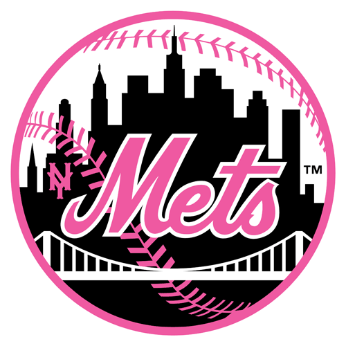
All Hail the Pink & Black New York Mets
The New York Mets' skyline logo has been a mainstay for the franchise throughout their entire history. Like most visual identities that have been around for 50+ years, the Mets logo has seen several slight adjustments—but it is, fundamentally, the same logo that was unveiled to the world on November 16, 1961.
Since that day the Mets core colors have been orange and blue. Full of symbolism, they are the official colors of the city of New York as well as an overt tribute to the departed Brooklyn Dodgers (blue) and New York Giants (orange.)
But what if the Mets colors were black and pink?
The Mets logo was created by cartoonist Ray Gotto. His impressive legacy is unfortunately forgotten today; in fact, he is (as of this writing) misidentified as "Gatto" in the Mets' official history. Gotto's now iconic emblem was the winning entry among 500+ competitors in a contest held by the club. He was paid $1,000 for his efforts.
And his initial concepts were rendered in pink and black.
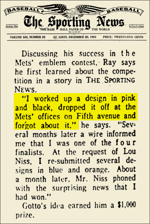
A December 20, 1961 profile of Gotto in The Sporting News quotes him as saying that "I worked up a design in pink and black, dropped it off at the Mets' offices on Fifth (A)venue and forgot about it."
It goes on to say that Lou Niss, the new team's publicist (and the first employee in the history of the Mets franchise) requested revisions that incorporated the colors orange and blue.
"Meet the Mets"—the team's official song— features the lyrics "(A)ll the fans are true to the orange and blue." Added at the behest of team owner Joan Whitney Payson, we can only speculate about what might have rhymed with "black and pink," although the Mets certainly did stink in their inaugural season of 1962.
UPDATE: I've found out why the Mets almost wore pink and black, and it makes sense—even if that particular color scheme would likely never have made sense.