Sports Logo Case Study #2—1944 Philadelphia Blue Jays/Phillies
The second in an ongoing series of entries about vintage sports identities. Sports fans, as I have often said, are the most ardent brand loyalists on the face of the earth. There are stories to be told here at the intersection of art, commerce, history, and fandom.
In the sports world, a change in visual identity is generally spurred on by either a) a change in franchise ownership, or b) the desire to separate from an era of failure on the field of play. In January 1944 the Philadelphia Phillies were getting ready for what was to become yet another year in the middle of a streak of 16 consecutive losing seasons. This was also to be the first season under a new ownership regime, led by 28 year-old Bob Carpenter Jr.
During the 1943-44 offseason the club hired marketing consultants in an effort to increase revenue and drum up fan support—a very unusual move for a Major League franchise back in those days, especially so in the middle of World War II. An additional nickname and a visual insignia were sought for the franchise, via a contest. This new monicker was intended to supplement the traditional Phillies nickname. A contest was announced on January 25, seeking a fresh name, one which would reflect the club's "new spirit," with a $100 war bond to be awarded to the winning entry.

The contest proved to be very popular, attracting over 5,000 suggestions. Carpenter was quoted as saying that the club had received "letters from every state in the union." Proposed nicknames "ranged from Daisies to Stinkers," but the winning entry was submitted by one Mrs. Elizabeth Crooks and announced on March 4—"Blue Jays." The accompanying logo appropriately featured a blue jay perching atop script "Phillies" lettering.
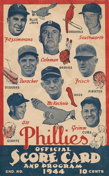
The bird was utilized as a sleeve patch by the club and was immediately featured on items ranging from scorecards to team letterheads to miscellaneous souvenirs. Jersey lettering was dark blue as was the club's headwear, which featured a white block sans-serif "P" both at home and on the road.

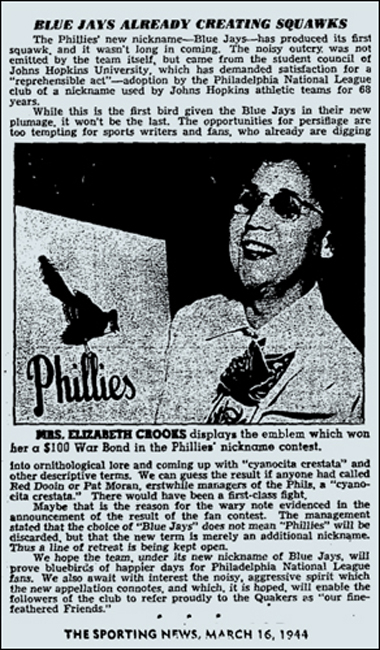
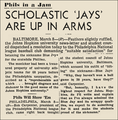
Reaction from certain quarters was swift and harsh. Students at Johns Hopkins University in Baltimore protested that the team had usurped their good name, which had used by the college since the 1870s. Philadelphia's adoption of the Blue Jays name was described in a petition as a "reprehensible act," one which dishonored their school due to the Phillies' long history of losing.
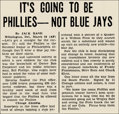
Rather than being angry, Philadelphia's fans were seemingly unsure about what to call their team, confused by the dual identities. The press mostly treated the name and logo change with apathy—after all, both home and road jerseys still said "Phillies."
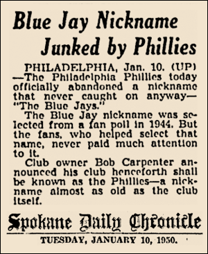
The blue jay sleeve patch was dropped when the club changed uniform designs in 1946, and the Phillies/Blue Jays experiment was formally abandoned by the club on January 10, 1950. That season the club would go on to win its first pennant in 35 years. The youthful 1950 "Whiz Kids" captured the hearts of Philadelphia baseball fans, despite having been swept by the Yankees in the World Series. The Phillies won another pennant in 1993, this time dropping the World Series to the American League champions, Toronto—the Blue Jays.