Sports Logo Case Study #11—the 1915 Phillies, MLB's First True Team Logo
The 11th in an ongoing series of entries about vintage sports identities. Sports fans, as I have often said, are the most ardent brand loyalists on the face of the earth. There are stories to be told here at the intersection of art, commerce, history, and fandom.
2015 marks the 100th anniversary of what I consider to be one of the first—if not the first—true team logos in the history of Major League Baseball.
What makes this a "true logo?" Simply put, it was used across a wide variety of platforms to promote the team as part of a cohesive strategy. Although we are bombarded by logos and corporate symbols today, this was very rare in the world of MLB before the late 1940s. Some of the most familiar icons associated with MLB clubs were either a) used solely on uniforms or b) developed much later than this one.
The logo made its debut during the 1915 World Series, which the Phillies lost to the Boston Red Sox.
The symbol first appears in the form of a medallion, designed by venerable Philadelphia jeweler J.E. Caldwell & Company. Part of a credential given to members of the press, an example of this rare keepsake sold at auction for more than $15,000 in August, 2013.
Located in the shadow of Philadelphia's City Hall, J.E. Caldwell & Company had a great source of inspiration close by from which to draw. From its perch high above Philadelphia, the 37 foot tall, 26 ton statue of William Penn atop City Hall has been a visible civic landmark since the turn of the 20th century.
An engineering marvel, Philadelphia's City Hall was the tallest building in the world from 1901-08. It remained the tallest building in the city of Philadelphia until the late 1980s.
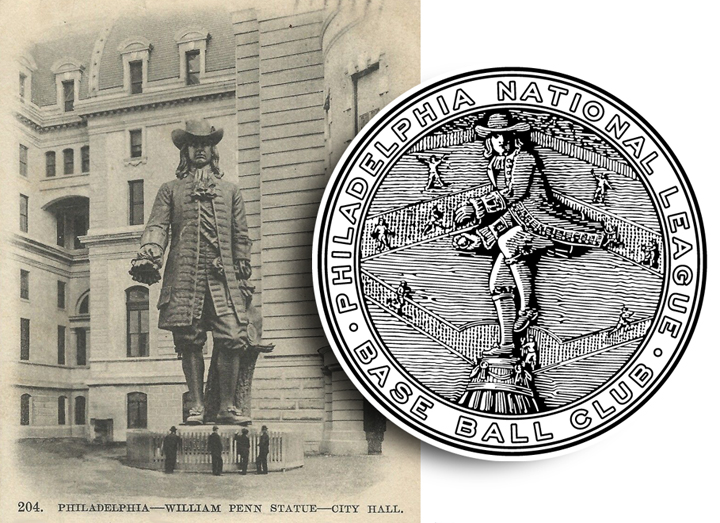

The logo features a Penn statue that has come to life, backed up by a chaotic scene involving nine other players. Abundantly detailed, the mark simply reads "Philadelphia National League Base Ball Club." Two things are noteworthy about this. The first involves the fact that "Phillies" is nowhere to be seen. The second involves the use of the antiquated two-word "Base Ball," which began to fade from use in the years following World War I.
What's also striking to me is the fact that this is a fun logo! There's a certain level of goofiness involved in this huge local icon having come to life, very out of character given the visual landscape of Major League Baseball at this time.
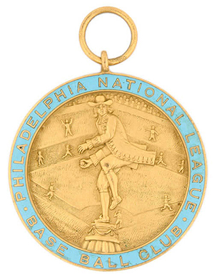

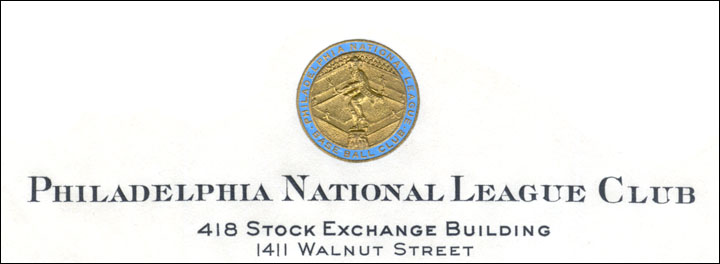
Though rarely seen in the years immediately following its launch, the club again featured the insignia in medallion form ten years later, this time as a solid gold season pass. The logo was used on team letterheads starting in 1926, and was seen on scorecards, schedules, and roster guides from the late '20s up until the early '40s.
1938, the Phillies changed their uniform colors to yellow and blue in honor of the tercentenary celebration of the 1638 Swedish landing in what is now Wilmington, Delaware. That season the club elevated their logo to star status, placing in on the sleeves of their uniforms for the first and only time.


It should be noted that the Phillies fielded some truly awful teams during these years. The club's average attendance for the entire decade of the 1930s was around 3,000 fans per game. They switched stadiums in the middle of the 1938 season, moving from Baker Bowl to the Athletics' Shibe Park. Modern sports marketing was being pioneered at this time—in 1935 the Cincinnati Reds hosted MLBs first night games. The Chicago Cubs employed graphic designer and marketing expert Otis Shepard, eventually named to the club's Board of Directors in 1945. The underfunded Phillies, a bare-bones organization with little vision or budget for promotion, phased out the Penn logo in 1940-41.
The club underwent an identity of crisis in the early '40s, officially changing their name from Phillies to "Phils" in 1942, then reversing course the following season. The team became "Blue Jays" a year after that, although that nickname never took hold in the public imagination.

Now long forgotten, the Phillies' William Penn logo served as the primary visual representation of the franchise for a quarter century. 100 years after it was introduced, it deserves a second look.