Frank Cashen, Fresh-Up Freddie, and the Birth of the Orioles Cartoon Bird
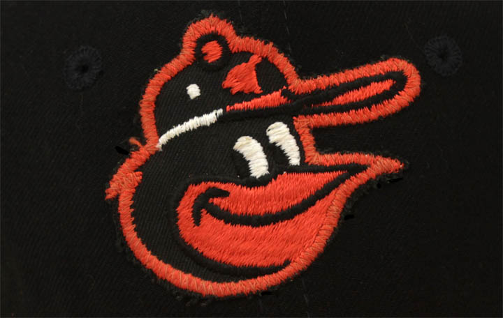
As the Baltimore Orioles power their way through the 2014 postseason, they do so with a logo on their caps that is being embraced by a new generation of fans. The "smiling bird"—or, alternatively, the "cartoon bird"—was originally introduced just in time for franchise's first World Series victory, in 1966.
This logo was used for 23 seasons, then fell into disuse for another 23 seasons. Its 2012 revival coincided with an Orioles resurgence that finds them one step away from the World Series for the first time in decades.
The current logo is closely based on the original, though not an exact replica. The 1966 origins of the original logo involve legendary baseball executive Frank Cashen, a 7 Up cartoon character named "Fresh-Up Freddie," Baltimore's National Brewing Company, and the Orioles' desire to successfully compete for marketing dollars with the National Football League's Baltimore Colts.
Some background is required.
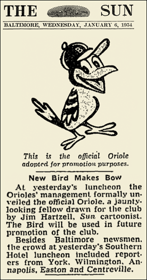
When the St. Louis Browns moved to Baltimore and became the Orioles in 1954, their first logo was a cartoon bird that was created by Baltimore Sun cartoonist Jim Hartzell. That bird, introduced at a luncheon on January 5, 1954, served as the club's primary logo until 1963.
Prior to that season, Orioles GM Lee MacPhail oversaw a brand remake which was punctuated by an austere on-field look that included the only instance in a club history that a script “Orioles” was not utilized on the team’s uniforms. A new, aggressive bird was introduced at this time.
Created by illustrator Hal Decker, this bird was never featured on the teams uniforms. Although the original Hartzell bird remained as the club’s official logo in ‘63, it was eliminated altogether the following year. The Decker bird was short-lived—as was the conservative uniform look. MacPhail left Baltimore to join the Commissioner's office in New York and the club embarked upon a new look for the 1966 season.
These years saw the Orioles become a serious American League pennant contender, but they were still a young franchise at this time, second in the hearts of fans and local advertisers to the NFL's Baltimore Colts.
National Brewing Company chairman Jerold Hoffberger acquired a controlling interest in the Orioles in June 1965, thus becoming chairman and majority owner. Hoffberger would tab Frank Cashen as Executive Vice President of the team in October of that year. Cashen had previously served as director of advertising for National Brewing, and was brought in, according to Hoffberger, to "sell" the public on the Orioles. In other words, before Frank Cashen became the architect of two World Series champions in Baltimore and one with the New York Mets, he was a marketing guy, brought in to promote the Orioles.
Under his direction, the team contracted Hollywood animation studio Quartet Films—a firm that had been creating characters for the brewer’s advertising campaigns—to create a marketable bird character for the club. Quartet, headed up by animator Stan Walsh, soon gave birth to an enduring brand. While Walsh is often given credit as the artist responsible for this bird, the work was actually done by Paul Carlson, who was art-directed by Walsh.
Cashen explained the process in his book "Winning in Both Leagues:"
…(S)peaking of raising the Orioles' image, history accepts that Hoffberger first sent me to the club to be VP of marketing, a position that I fully understood after working at National Brewing for four years. Coming with that assignment was a flood of ideas. "How can you change the opinion and impression the average fan had of the Orioles?"
One of my very first thoughts was that the oriole "bird" that was pictured on the front of the official baseball cap, and served as the clubs symbol, was too sedentary. It was supposed to be a small oriole, but it looked to me more like a tiny sparrow. Having just concluded a series of new beer commercials at National, the bulk of them being cartoon related, I had a couple ideas that I wanted to discuss with the Los Angeles advertising crowd. I contacted Stan Walsh, who had done some work for National Brewing. Stan had been a cartoonist for the Walt Disney Studios prior to opting for commercial work, and we had been fairly good friends. In short order Stan sent me examples of aggressive cartoon birds, one of which became the new symbol of the Orioles and was immediately transferred to the 1966 baseball caps.
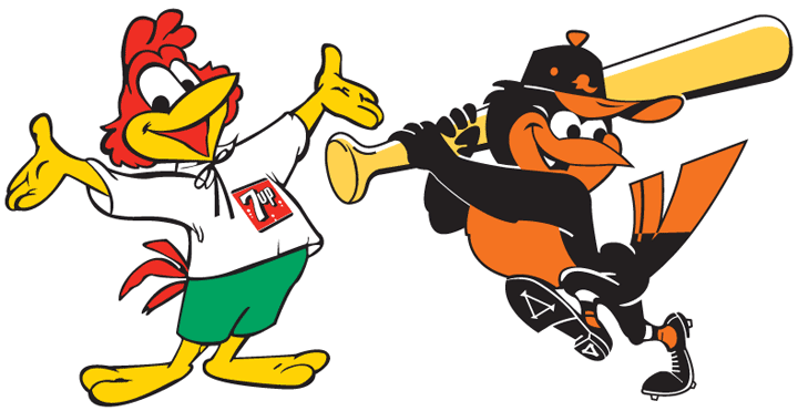
Quartet Films, located in LA, had previously created animated characters such as Tony the Tiger and the Jolly Green Giant, as well as the Hamm's Beer bear.
In 1957, while working at Disney, animator/illustrator Carlson created 7 Up spokes-bird Fresh-Up Freddie. The resemblance between Freddie and the Orioles' cartoon bird is unmistakable:
The cartoon Orioles bird was unveiled just in time for the genesis of one of the greatest eras that any franchise has ever experienced. The “smiling bird” served as witness to three World Series championships: 1966, 1970, and 1983. This golden era also saw the team win American League pennants in 1969, 1971, and 1979.
By the late 1980s, it had fallen out of favor. The 1988 season was the worst in the history of the franchise. The team began the year by going 0-21, and finished the year with a total of 107 losses.
The definitive end of an era of excellence would require a new look on the field. The cartoon bird seemed dated and stale. In 1988, Orioles outfielder Fred Lynn was quoted as saying that the team uniforms were ugly and that the caps were “the worst.” “Look at that goofy bird on it,” Lynn said. “There’s nothing menacing about that bird.”
The Orioles unveiled a their new, ornithologically correct bird on December 14, 1988. Team officials said that they wanted to “get back to a more traditional look,” essentially the same reason cited for the 1963 change.
A series of realistic birds followed the franchise from Memorial Stadium to Camden Yards, and into the new millennium. Finally, in 2012, the cartoon bird was restored. That season the Orioles finished with a winning record for the first time since 1997 and made the playoffs.
Frank Cashen passed away on June 30, 2014, at the age of 88. His legacy as a master builder of championship teams is well-established, but his connection to the Orioles' beloved cartoon bird has largely been forgotten.
Nothing succeeds like success. The cartoon bird is associated with winning in Baltimore, the most effective marketing tool imaginable for any sports franchise.