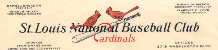
The Cardinals' "Birds-On-Bat" Logo Opened To Mixed Reviews in 1922
The St. Louis Cardinals' time-honored "birds-on-bat" uniform design is widely considered to be among the classiest in Major League Baseball. More than nine decades of visual tradition have served as the backdrop for eleven World Series championship teams.
As I have previously noted, the Cardinals' look was famously created by Branch Rickey. Rickey, then Cardinals Vice President and General Manager, was invited to speak at the Men’s Fellowship Club of the Ferguson (Missouri) Presbyterian Church on February 16, 1921. Congregant Allie May Schmidt was tasked with creating table decorations for the event. Her decorations that night—cardboard cutouts of red cardinal birds, perched atop twigs made out of string—inspired Rickey.
Rickey then commissioned Allie May’s father, Edward H. Schmidt—head of the art department at the Woodward and Tiernan Printing Co—to create artwork for the Cardinals’ uniforms. The rest is history. Starting in 1922, the two “birds on bat” have graced the St. Louis uniforms, with the exceptions of 1927 (when a single bird on bat celebrated the team’s World Series championship of 1926) and 1956, when the birds disappeared for a single season.
The Cardinals' new look was a bold one for the baseball world of 1922. A representative sampling of some MLB uniforms from that season provides some insight into why the Cards' aesthetics were so noteworthy:
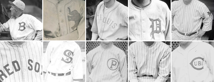
This was not exactly the golden era for uniform decoration or innovation in Major League Baseball. News of the team's uniforms was first reported during spring training:
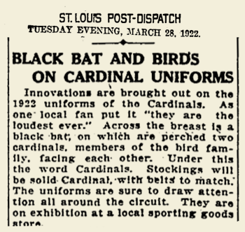
The Cardinals broke spring training and returned to St. Louis for two exhibition games with their Sportsman's Park co-tenants, the St. Louis Browns, on April 8 and 9. In anticipation of the mini-series, the St. Louis Post-Dispatch provided readers with a blisteringly snarky critique of the new look:
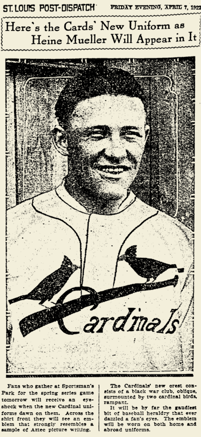
Fans who gather at Sportsman's Park for the spring series game tomorrow will receive an eye shock when the new Cardinals uniforms dawn on them. Across the shirt front they will see an emblem that strongly resembles a sample of Aztec picture writing. The Cardinals' new crest consists of a black war club, oblique, surmounted by two cardinal birds, rampant.
It will be by far the gaudiest bit of baseball heraldry that ever dazzled a fan's eyes. The emblem will be worn on both home and abroad uniforms.
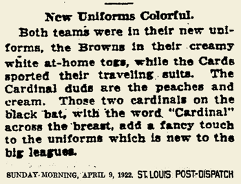
The Post-Dispatch apparently came around to the charm of the uniforms after seeing them in action during those two exhibition games:

The first regular season game in which the "birds-on-bat" saw action was the 1922 home opener, on April 12, against the Pittsburgh Pirates. The effect was not lost on the Pittsburgh Press, which referred to the team as "Branch Rickey's red birds, a new name for the Cardinals."
Post-Dispatch columnist L.C. Davis composed an Opening Day poem, appropriately entitled "The Opener," published that day:
The Cardinals' new uniform Will take the populace by storm— For they are sure a classy bunch of dressers. They'll set the pace, likewise the style, And win the pennant by a mile Unless the local fans are rotten guessers.
Media opinions from rival National League cities were nearly universally positive. On April 8, 1922, the Boston-based Christian Science Monitor declared the new togs to be "striking."
The Brooklyn Daily Eagle chimed on April 11, 1922 with the following:
CARDINALS' SNAPPY UNIFORMS The uniforms the St. Louis Cardinals for this season weren't selected by mere man. Across the breast is a black bat, on which are perched two red birds (cardinals.) Under this is the word "Cardinals" in bold red letters.
Finally, on June 20, 1922, the New York Tribune declared that:
The Cardinals are the Beau Brummels of the league. They have four hand-embroidered uniforms apiece. The extra spangles are for Saturdays, Sundays and movable feast days.* Their home uniforms have candy-stick stockings which are the only serious contenders with the Giant hosiery for the prismatic championship of the big time circuit.
* The team also wore alternate home uniforms that year which featured the word "Cardinals" in fancy red letterforms, arched against a pinstriped background, a single cardinal featured as a sleeve patch.
93 years later, the Cardinals and their "birds-on-bat" are inseparably connected. The club's uniforms are rightfully considered to be iconic—a sentiment that even the Post-Dispatch would probably be inclined to agree with.