Beauty in the Details—Finding Art in Vintage World Series Tickets
Before bar codes, before StubHub, before we printed tickets out at home and were forced into joylessly scanning them ourselves upon entering a stadium, we had tickets. Real tickets. Pasteboards, ducats, rain checks.
And these tickets were, more often than not, chock full of copious and wonderful details, customized letterforms, and all sorts of archaic references that are seemingly frozen in time. How about background patterns? Like banknotes, these were included in order to fend off potential counterfeiters in the days before photocopiers, much less scanners.
Oversized, beautifully designed World Series tickets still exist today. I have the ticket stubs to the more than 30 World Series games that I have attended, dating back to 1977, and some of the more recent examples are some of the best, colorful and stunning pieces of art. But I get the feeling that the days of actual World Series are numbered, not only because of changing technology but also because of our own wants, needs, and desires for convenience and portability.
Consider this. On October 30, 2013, I was at Fenway Park in Boston, where I saw the Red Sox win the World Series at home for the first time in 95 years. Exiting the ballpark into a raucous sea of celebration, I spotted a piece of paper on the ground. It was an electronically-generated ticket to the game, a souvenir of a historic moment, trampled under foot, sadly discarded. Or not so sadly discarded, because it was an ugly mess, at best. QR code. Bar code. Six or seven dense paragraphs of five point type, informing the bearer that the paper in question is a revocable license, and that the user accepts the risk of injury. See where I am going here? Function sweeps form in four games, Series over.
The earliest World Series tickets were no better than the sad piece of barcoded paper that I have just described, utilitarian in nature, devoid of visual specificity or charm. Things began to change in the late 20s. By the mid to late 40s they really hit their stride. Each participating team was responsible for their own designs until 1974, when MLB took over with a standardized design for both American and National League champions.
Here are some pieces of Octobers past, all much more enjoyable to look at than a QR code.
1940 Cincinnati Reds

There's an abundance of charm contained within the typographic details of this 1940 ticket from the Cincinnati Reds. Script type on a curve is always an unconventional choice, but this example retains legibility, despite the all the funkiness. Note the fact that the letters are straight up and down until you hit the "n" in "Championship." Then, like a downward roller coaster, they descend from there. The Reds defeated the Detroit Tigers in seven games, their first World Series championship since 1919.
1950 Philadelphia Phillies

Phillies? Yes, the Philadelphia Phillies represented the National League in the 1950 World Series. They got their butts handed to them by the New York Yankees. But what's really interesting about this ticket is what lies beneath. Look at the lettering in the background. The Phillies also declare themselves to be "Fighting' Phils," and "Whiz Kids" here. The team could also have added "Blue Jays" into the mix had they printed these at the beginning of the calendar year.
1935 Chicago Cubs
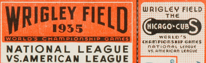
There's some fantastic Art Deco typography here, along with two great lockups—look at the "Chicago Cubs" thing at right, almost a logo unto itself.
1967 St Louis Cardinals
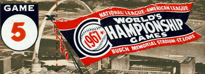
The pennant illustration conveys all the information one would need, albeit in a very formal way for the NL champions from the Summer of Love. How about a "World Series" here? The Gateway Arch is depicted too, it was brand new then.
1969 New York Mets
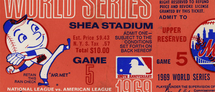
The 1969 World Series belonged to the Miracle Mets and their mascot, Mr. Met. 1969 also marked the first appearance of the MLB silhouetted batter logo on a World Series ticket; it was created in conjunction with that year's centennial celebration of professional baseball.
1972 Oakland A's
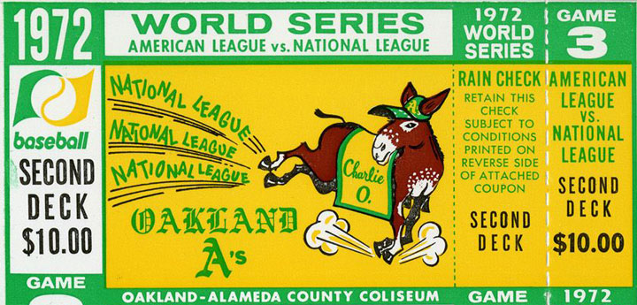
In 1972, the Oakland A's made the wise choice to highlight their mascot, Charlie O., on their World Series ducats. As I wrote in the Sporting News:
A mule had been suggested as an Athletics mascot as early as 1959, reportedly by a Kansas City councilman of the Democratic persuasion. The A’s had utilized an elephant as their trademark starting in 1902, when they were the Philadelphia Athletics. A Republican symbol would clearly not cut ice in heavily Democratic Missouri — enter “Charlie O.,” the Missouri mule, introduced in April of 1965.
Another noteworthy visual lies to the left of Charlie O.—the MLB "bannermark," a logo that was used alongside the MLB silhouetted batter emblem during the term of commissioner Bowie Kuhn. This logo last appeared on World Series tickets in 1976.
1949 Brooklyn Dodgers
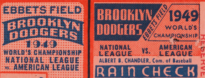
There are at least nine or ten different typefaces nestled within this charming 1949 ticket to Ebbets Field. Balance, symmetry, and minimal color usage all combine to prevent it from falling into utter chaos. The Dodgers dropped the World Series to Yankees that year.
1947 New York Yankees

The Yankees' classic top hat logo was created by legendary artist Lon Keller in 1946. The Bombers would have to wait until the following year to use it on a World Series ticket. The emblem would appear on World Series tickets fourteen more times over the following seventeen seasons.
1931 Philadelphia Athletics
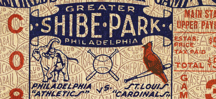
The 1931 World Series saw a rematch of the previous Fall Classic, and it featured the Philadelphia Athletics and the St. Louis Cardinals. There are several items of note here. Shibe Park, was, of course, the home ballpark of the A's. The club referred to their stadium as "Greater Shibe Park" after renovations were undertaken in 1925. There's lots to chew on here from a visual perspective, the most obvious being the logos of the participating clubs. Typographic overprints and the wonderful "S" letterforms within the club names help complete the picture.